Pay4Me Landing Page Redesign
Simplifying User Experience to Boost Conversions
Simplifying User Experience to Boost Conversions
Role
UI/UX Designer
Platform
Web
Tools
Figma, Isocons, Framer
Timeline
2024
Overview
Pay4Me is a cutting-edge Fintech platform that provides international students with the easiest and fastest way to pay tuition, application fees, and other payments to educational institutions, businesses, and government agencies worldwide. It streamlines the often complicated process of making international payments, ensuring security, efficiency, and convenience for its users.
Pay4Me is a cutting-edge Fintech platform that provides international students with the easiest and fastest way to pay tuition, application fees, and other payments to educational institutions, businesses, and government agencies worldwide. It streamlines the often complicated process of making international payments, ensuring security, efficiency, and convenience for its users.
Challenges
The current landing page struggled to communicate the value proposition effectively, resulting in low user engagement and fewer conversions.The goal of the redesign was to enhance the user experience, improve the platform’s visual appeal, and ultimately drive higher engagement and conversion rates.
The current landing page struggled to communicate the value proposition effectively, resulting in low user engagement and fewer conversions.The goal of the redesign was to enhance the user experience, improve the platform’s visual appeal, and ultimately drive higher engagement and conversion rates.
The current landing page struggled to communicate the value proposition effectively, resulting in low user engagement and fewer conversions.The goal of the redesign was to enhance the user experience, improve the platform’s visual appeal, and ultimately drive higher engagement and conversion rates.
The current landing page struggled to communicate the value proposition effectively, resulting in low user engagement and fewer conversions.The goal of the redesign was to enhance the user experience, improve the platform’s visual appeal, and ultimately drive higher engagement and conversion rates.
My Process
My Process
Understanding Pay4Me’s Offering and Audience
To effectively redesign Pay4Me's landing page, I began by gaining a deep understanding of its offerings and target audience. This allowed me to capture the right personality, tone, and message needed for the designs and copy. Pay4Me is a payment platform that primarily serves students, immigrants, and individuals who need a fast, secure, and reliable way to send and receive payments across borders.
The target audience are mainly international students who needs to pay for their application fee, tuition fee, sevis and visa fee to ensure that they can attend the school of their choice across borders without having to deal with the stress of making payments.
Auditing the Existing Platform
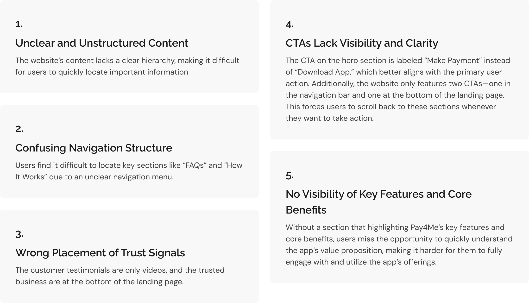
I carried out a comprehensive UX audit of the current website, focusing on six essential areas: Content Structure, Responsiveness, Navigation, Visual Design, User Feedback, and Accessibility. The findings revealed key opportunities for improvement and guided the redesign approach.
These are my findings:
Analyzing the Competitive Landscape
I conducted a competitive analysis of platforms offering services similar to Pay4Me, including Grey, ChipperCash, and Geegpay. The goal of this analysis was to understand how these platforms present their offerings and build trust, aiming to enhance user engagement and conversion.
Understanding Pay4Me’s Offering and Audience
To effectively redesign Pay4Me's landing page, I began by gaining a deep understanding of its offerings and target audience. This allowed me to capture the right personality, tone, and message needed for the designs and copy. Pay4Me is a payment platform that primarily serves students, immigrants, and individuals who need a fast, secure, and reliable way to send and receive payments across borders.
The target audience are mainly international students who needs to pay for their application fee, tuition fee, sevis and visa fee to ensure that they can attend the school of their choice across borders without having to deal with the stress of making payments.
Auditing the Existing Platform
I carried out a comprehensive UX audit of the current website, focusing on six essential areas: Content Structure, Responsiveness, Navigation, Visual Design, User Feedback, and Accessibility. The findings revealed key opportunities for improvement and guided the redesign approach.
These are my findings:
Analyzing the Competitive Landscape
I conducted a competitive analysis of platforms offering services similar to Pay4Me, including Grey, ChipperCash, and Geegpay. The goal of this analysis was to understand how these platforms present their offerings and build trust, aiming to enhance user engagement and conversion.
Solution
Solution
Intuitive Navigation
I updated the navigation bar to include links to the "How it works" section of the landing page, I split the support section and include links to the "FAQs" and "Contact Us" page. I also ensured that the labels were clear and intuitive to make it easier for users to navigate the website and access essential information effortlessly.
Optimizing the CTA for Clarity and Action
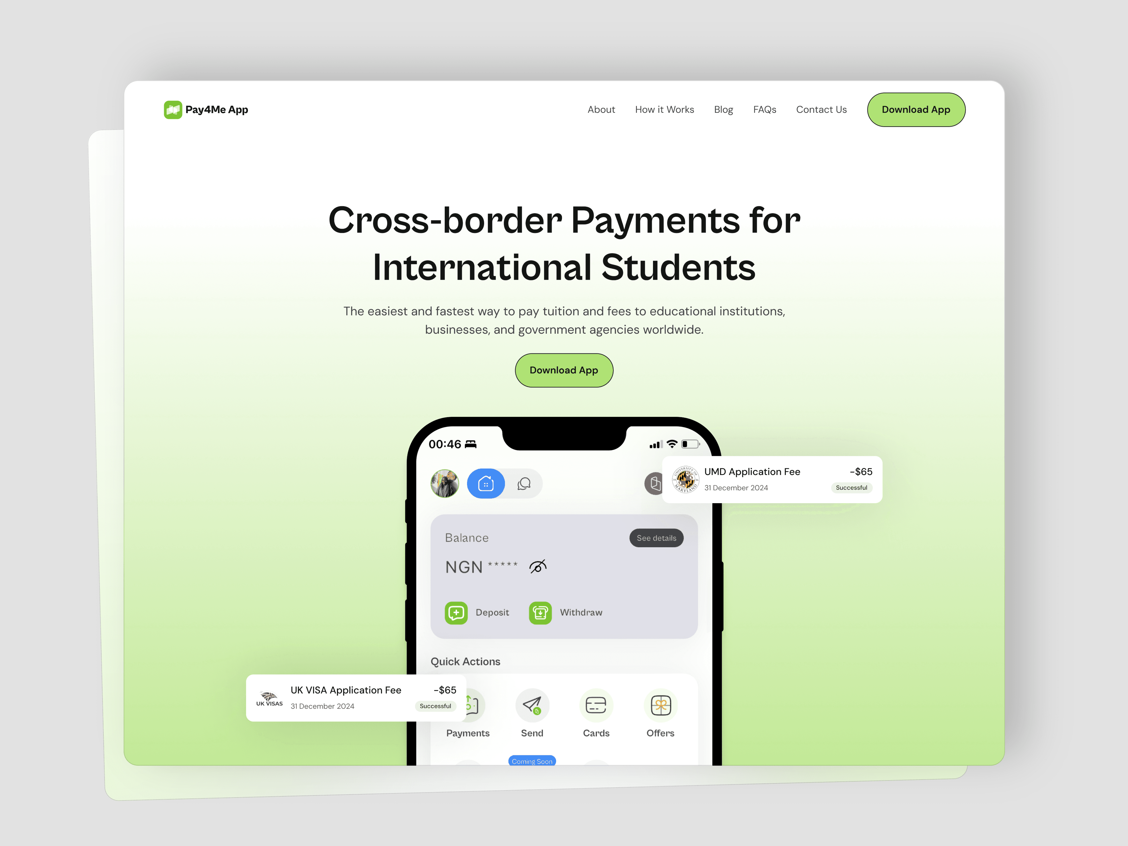
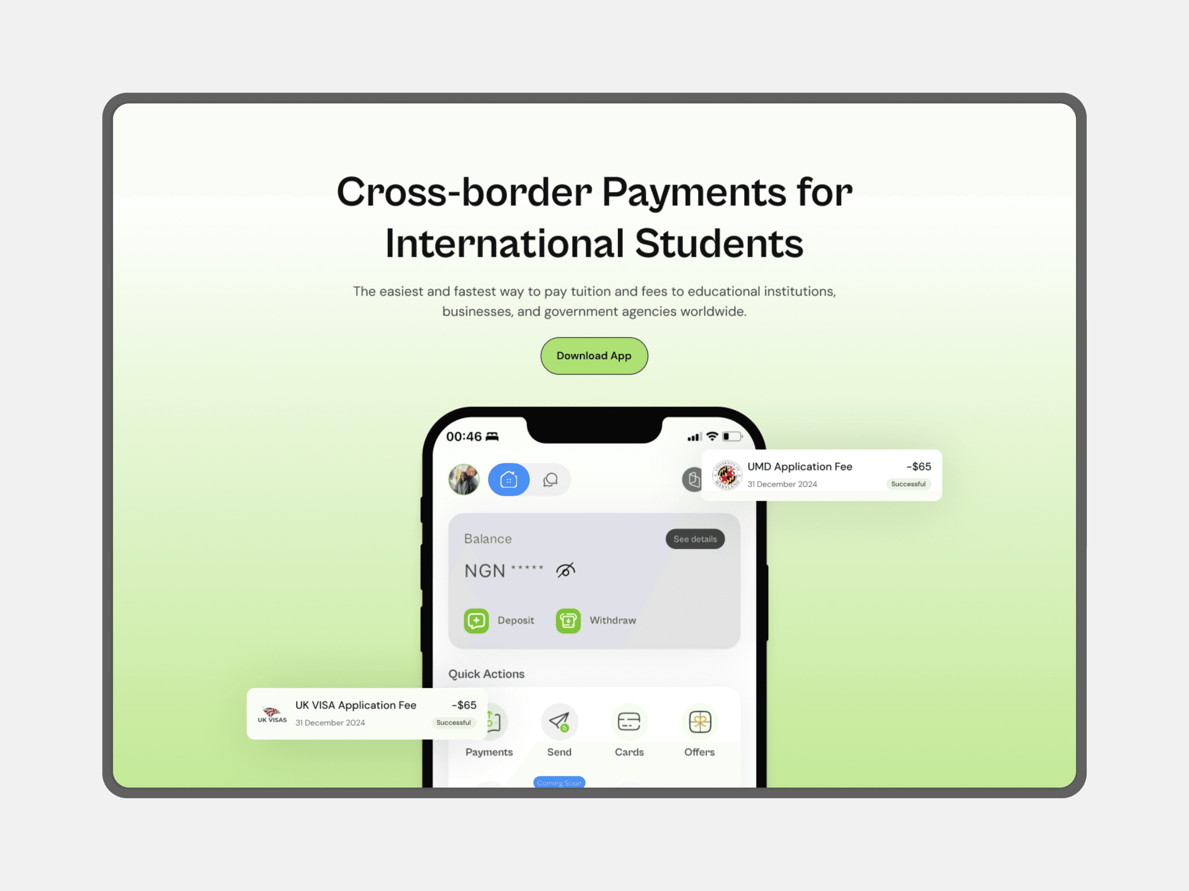
I changed the CTA from “Make a Payment” to “Download App” to better align with the primary action users want to take—downloading the app. While the current button says “Make a Payment,” it still redirects users to download the app. This update ensures the CTA is clear, relatable, and matches user expectations.
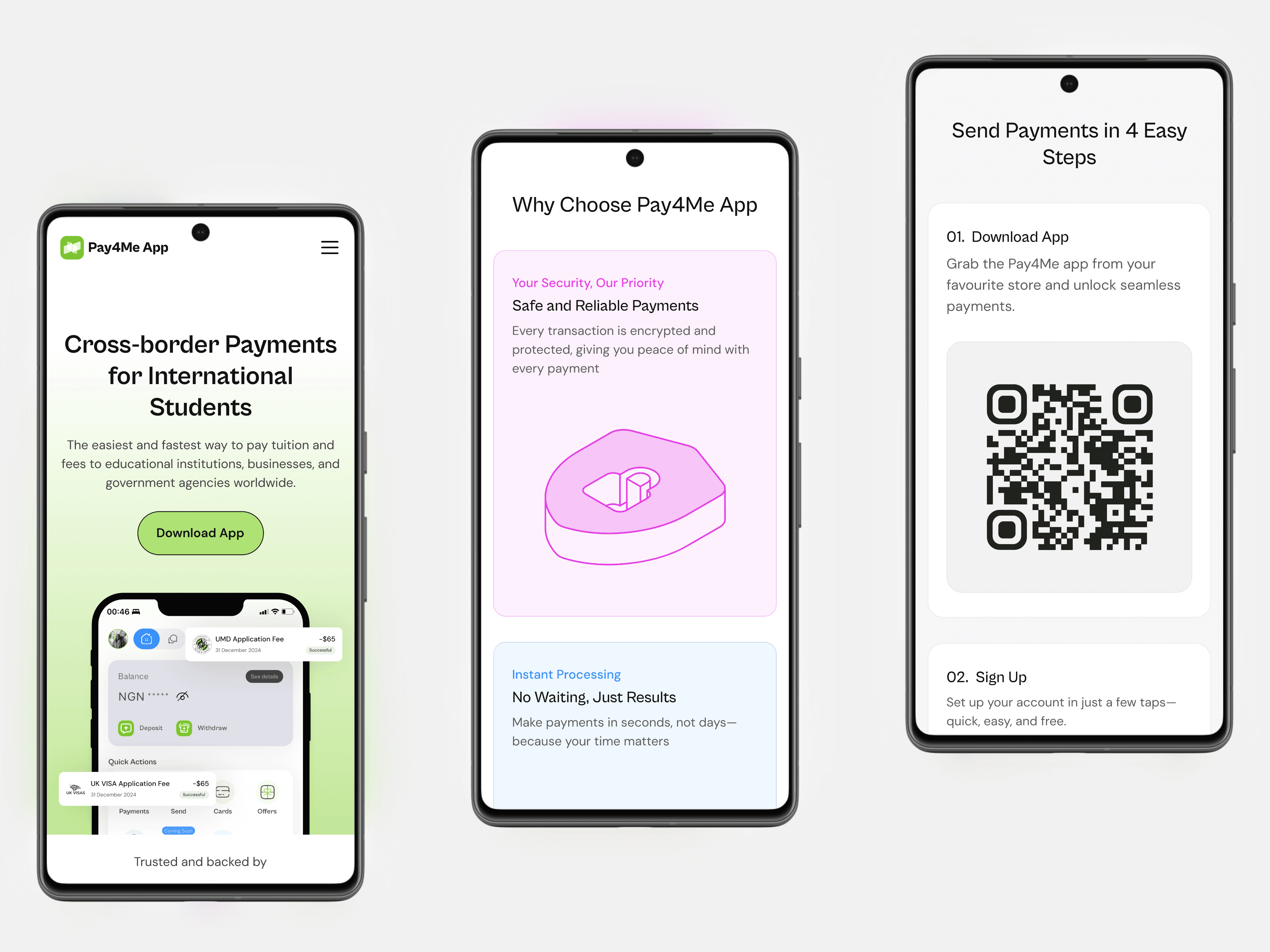
Visible Trust Signals
I moved the number of businesses using the Pay4Me app right after the hero section to help build trust. I also added logos of well-known businesses that backed Pay4Me to make the platform feel more reliable.
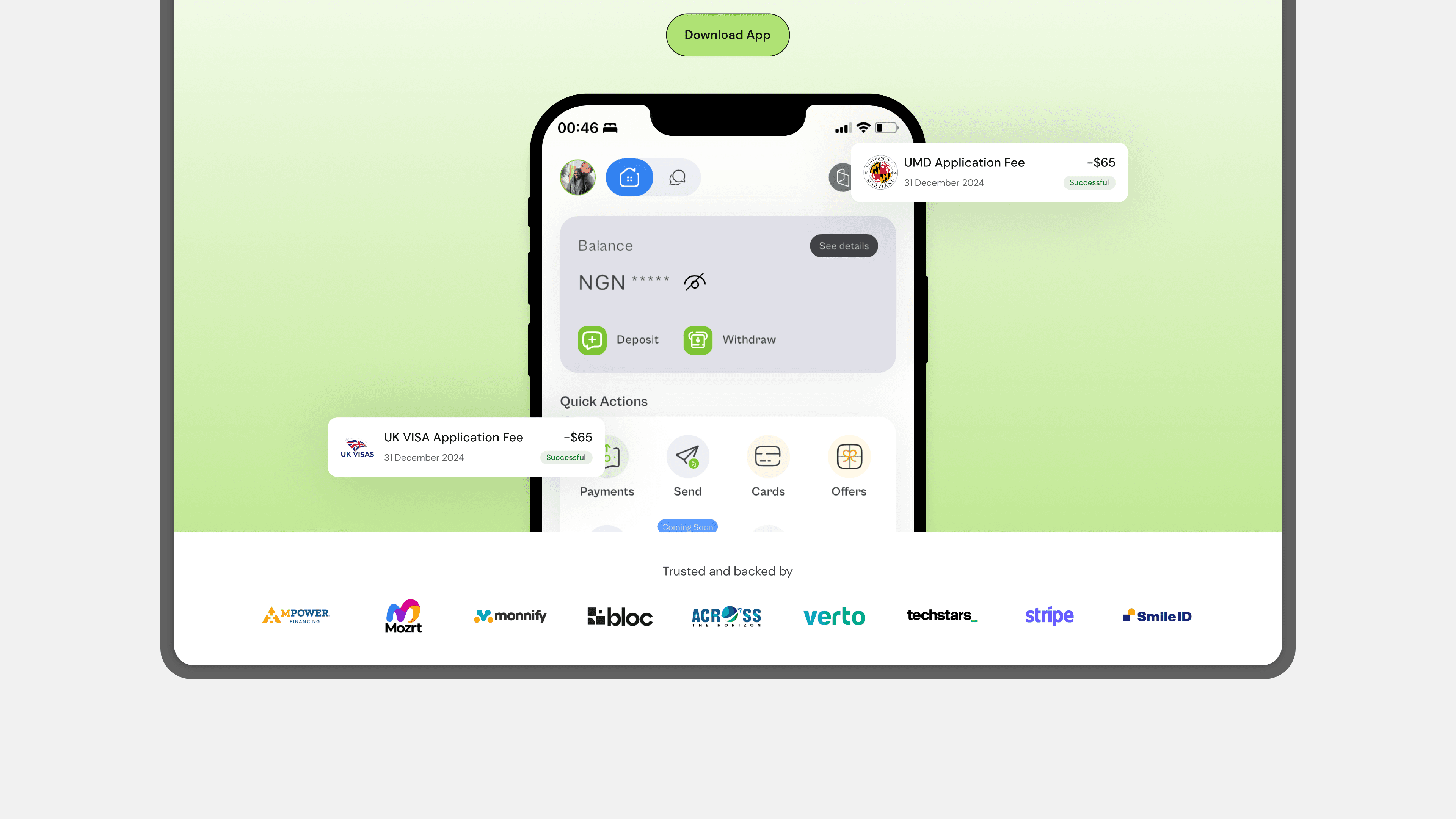
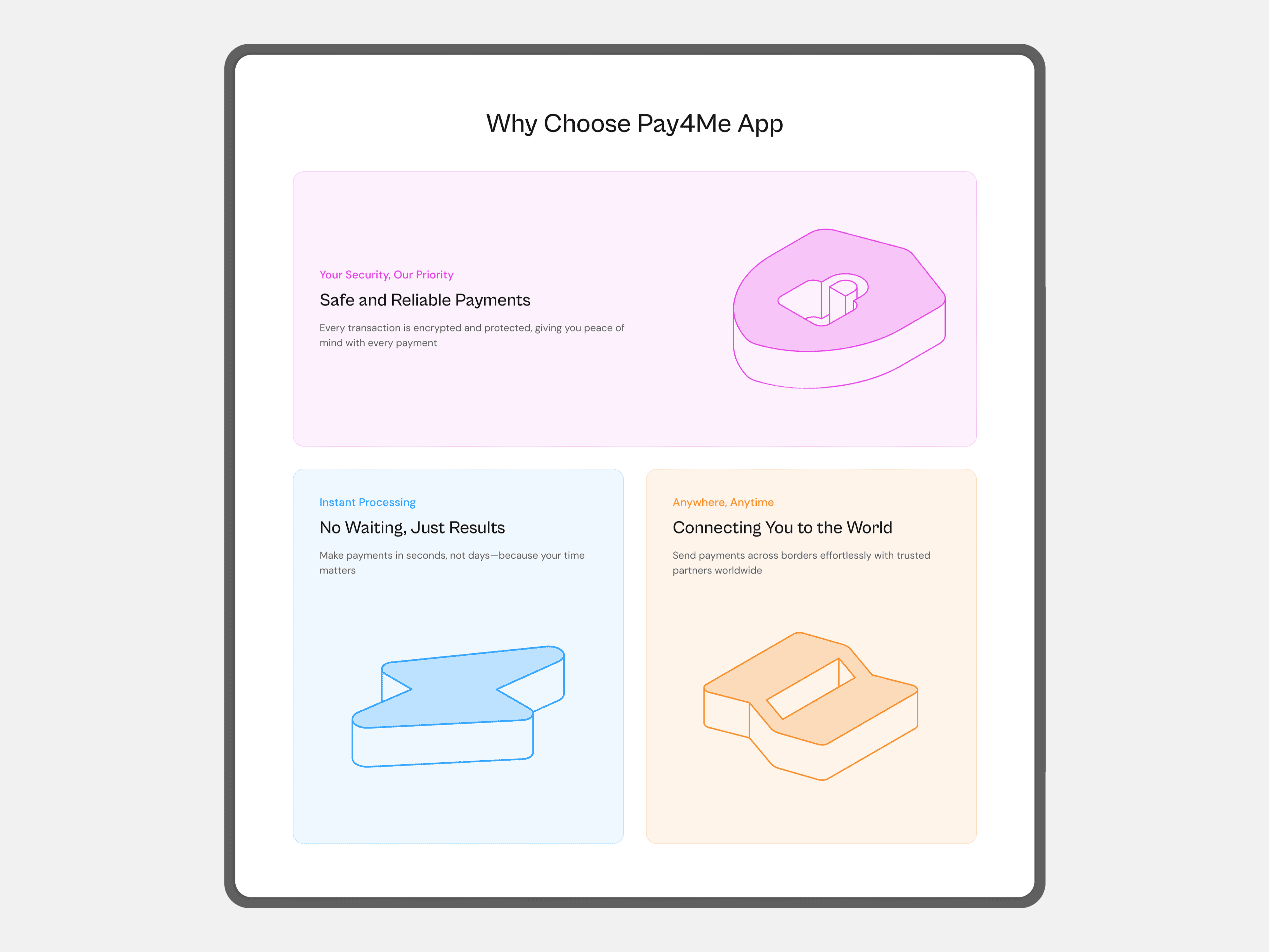
Highlighting Pay4Me's Core Benefits
I identified the key benefits of using the Pay4Me app that would instantly appeal to users and decided to highlight them in a dedicated “Why Use Pay4Me” section. This helps users quickly understand the value Pay4Me offers and builds trust in the platform.
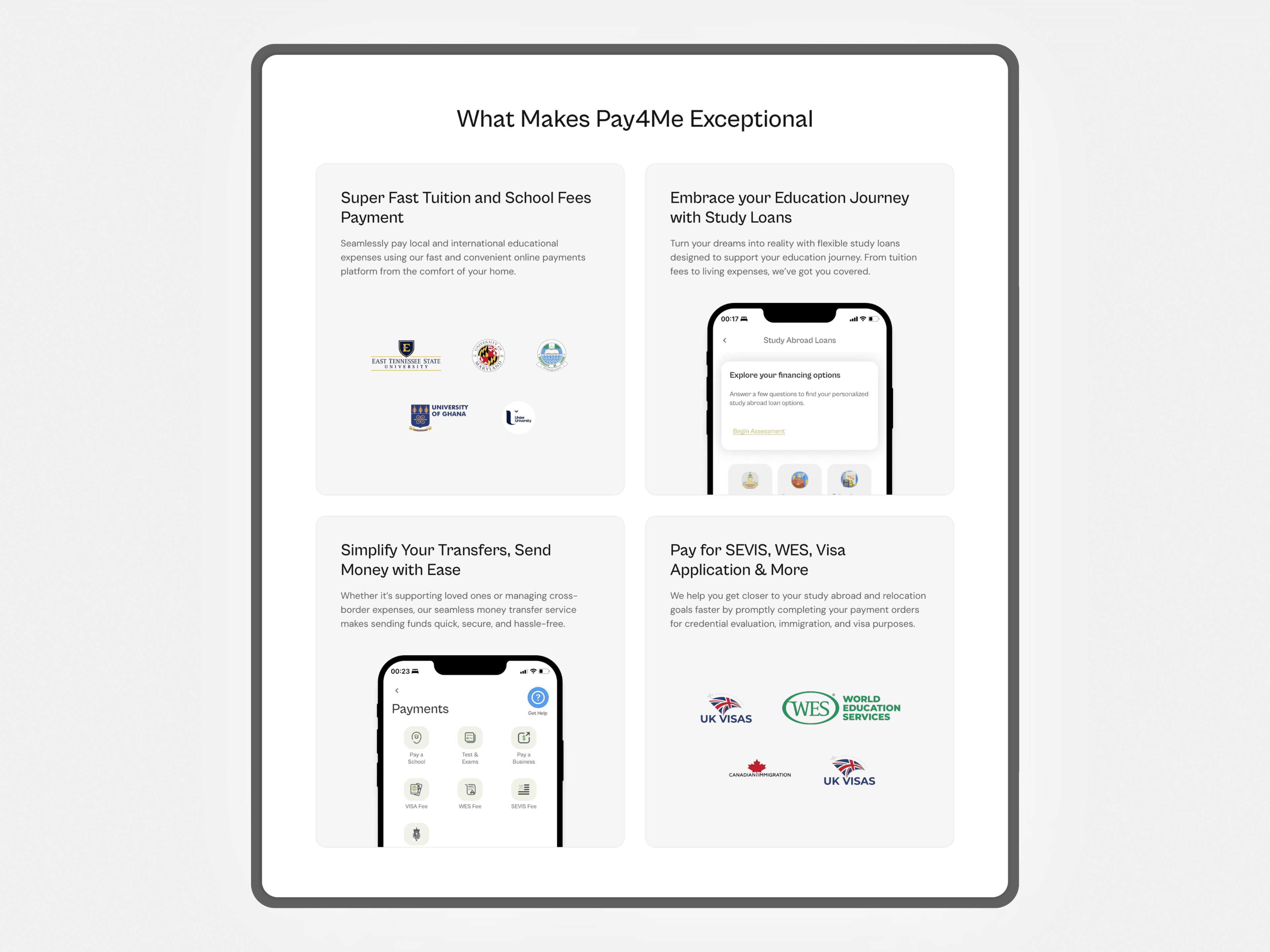
Spotlighting Pay4Me’s Unique Features
To improve user engagement and ensure clarity, I focused on highlighting Pay4Me’s key features and unique offerings to clearly communicate what users can achieve by using the Pay4Me app. This approach not only informs users about the platform’s capabilities but also strengthens their trust and confidence in using the service.
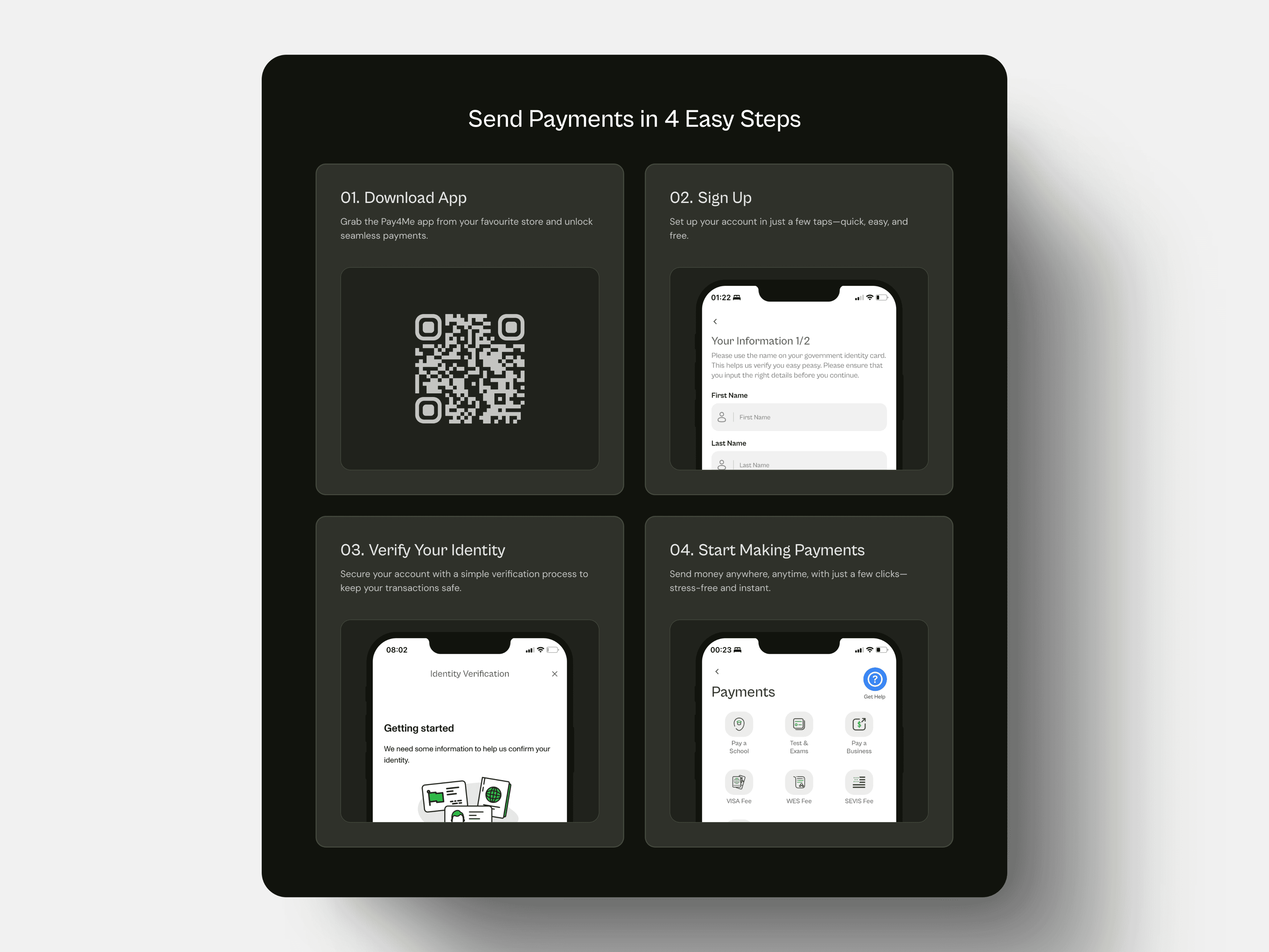
Simplifying Onboarding: Clear Steps to Get Started with Pay4Me
I outlined the steps required to open an account and start making payments, ensuring that users are fully informed and empowered from the moment they visit the landing page. This approach reduces friction during the onboarding process, providing clarity and encouraging new users to take action, ultimately leading to a smoother and faster adoption of the platform.
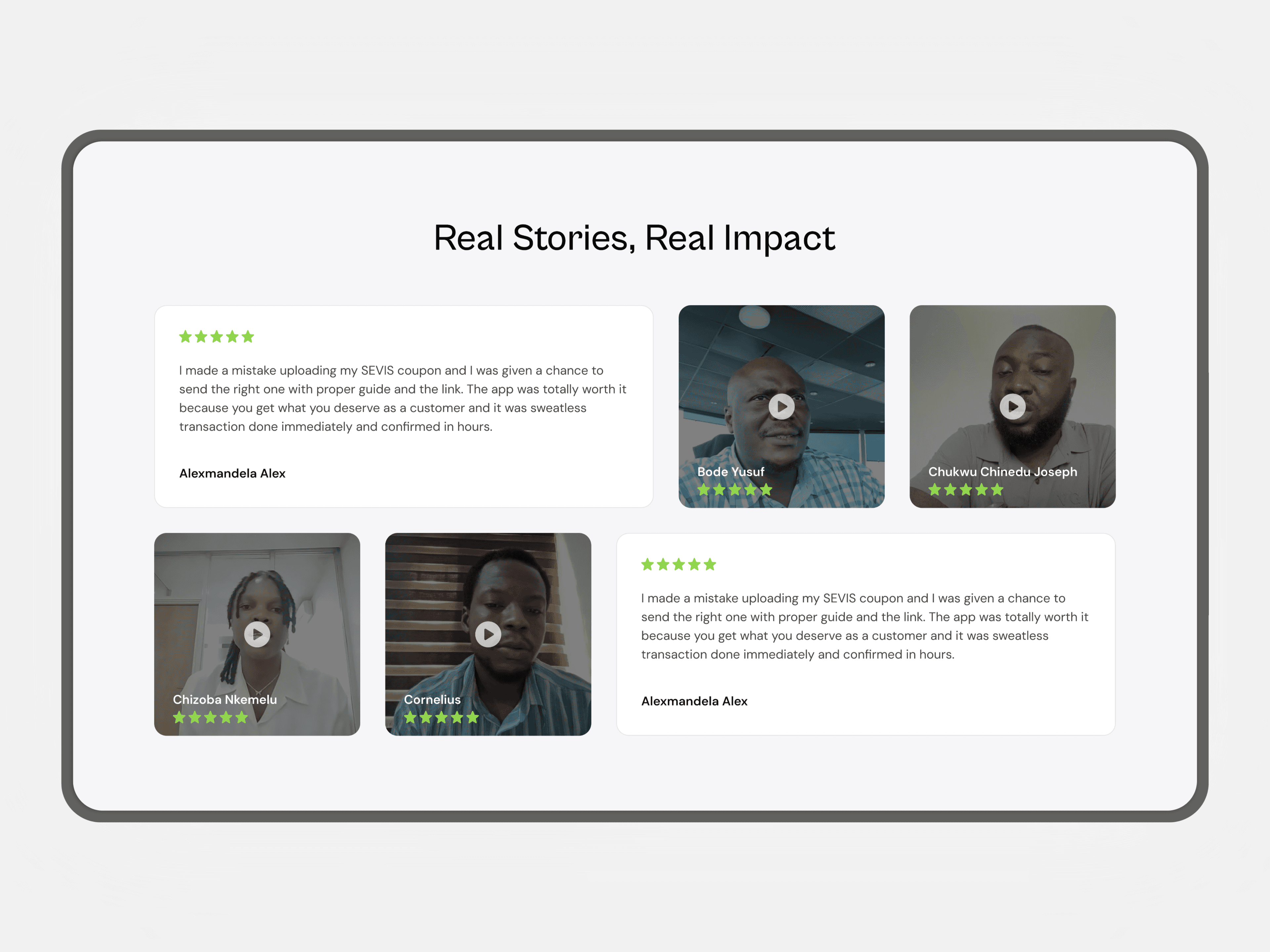
Showcasing social proof
I enhanced the testimonials section by incorporating both video and text reviews from satisfied customers. This update was designed to build trust and instill confidence in website visitors, reinforcing the credibility of the platform.
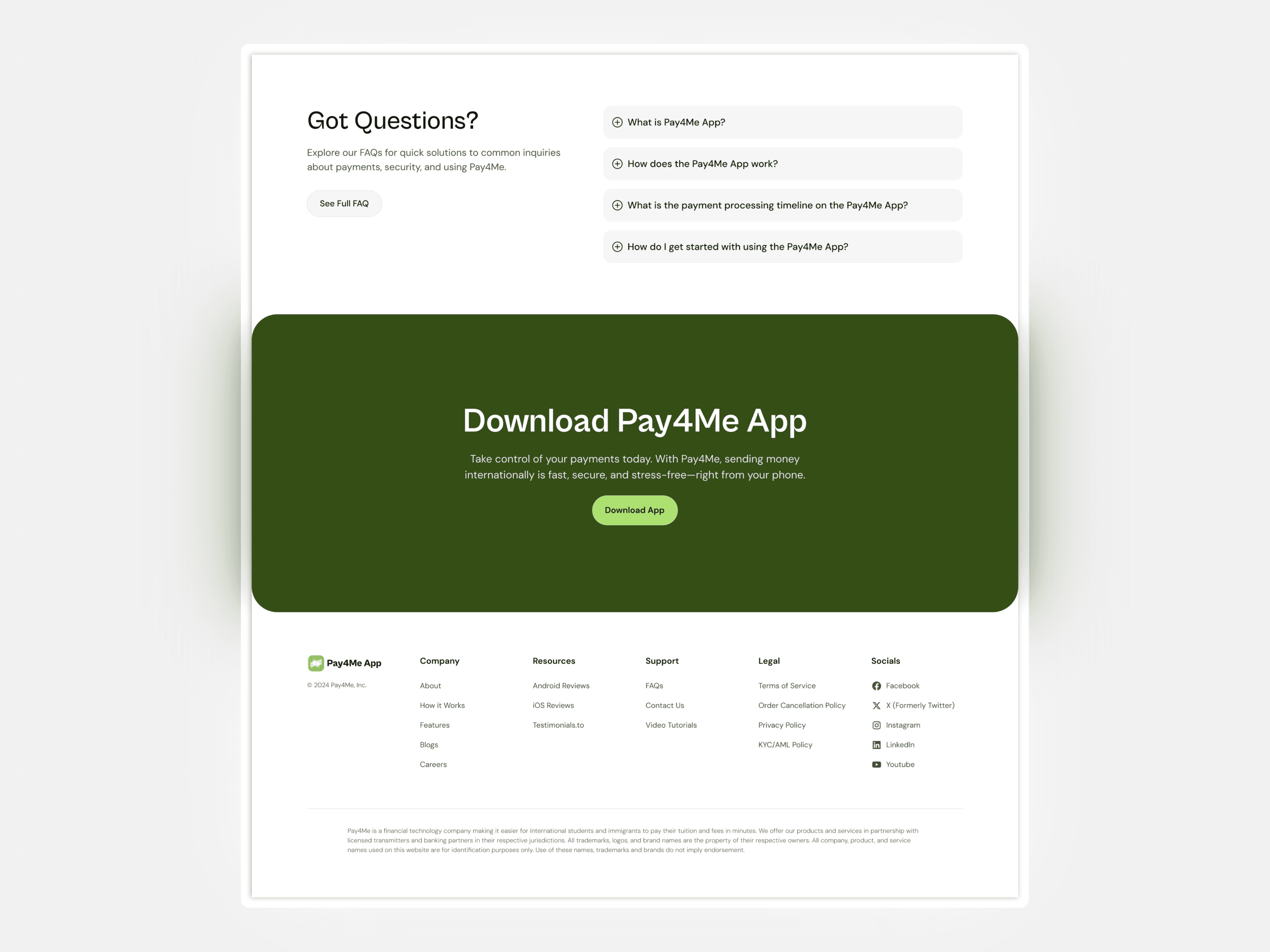
Driving Action with Clear CTAs and Helpful FAQs
I added clear call-to-action buttons to encourage users to take steps like Downloading Pay4Me App. The FAQs section answers common questions, making it easier for users to understand the platform and feel confident in using it.
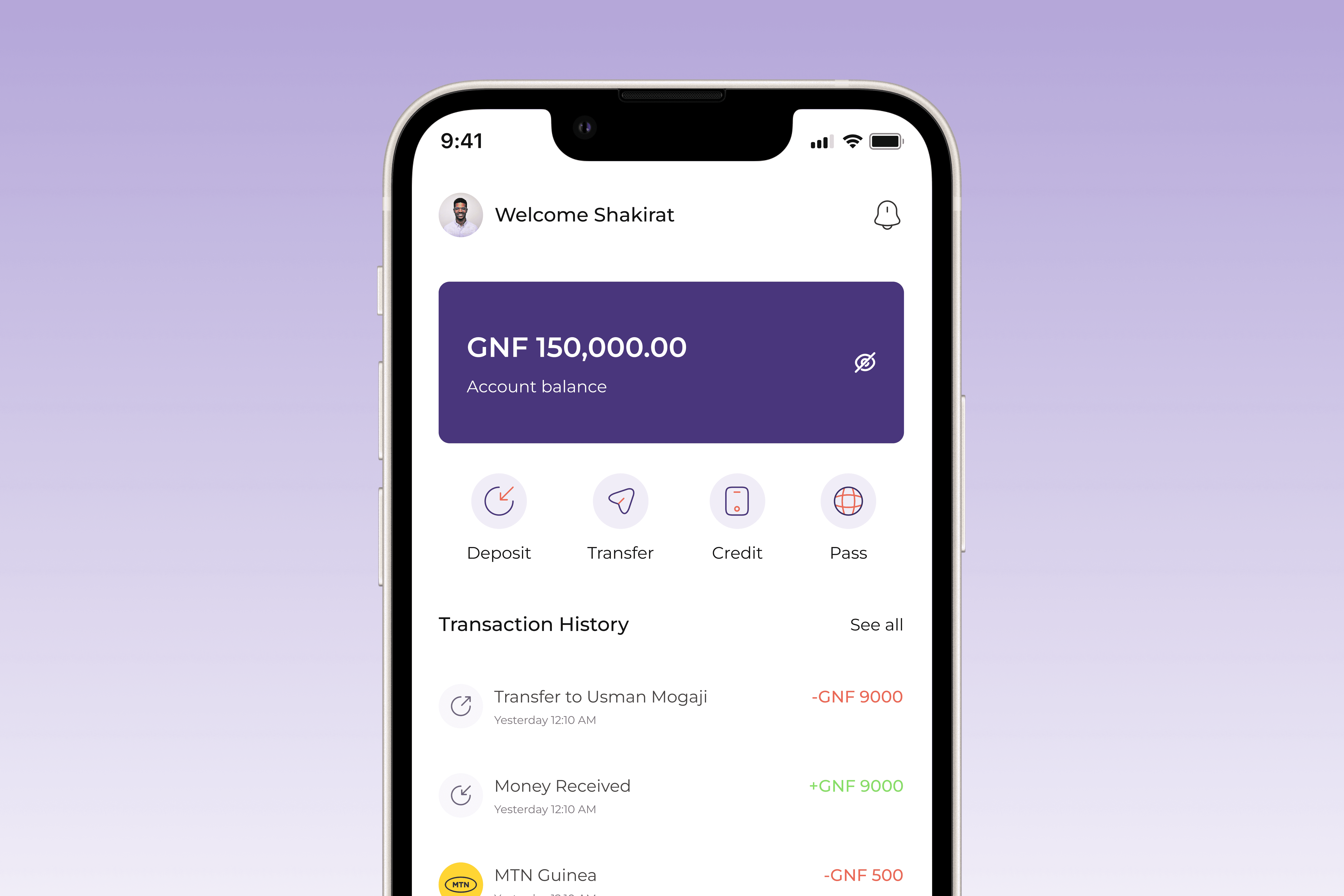
Mobile Version
I also designed the mobile view of the entire website to ensure consistency and responsiveness throughout.
Intuitive Navigation
I updated the navigation bar to include links to the "How it works" section of the landing page, I split the support section and include links to the "FAQs" and "Contact Us" page. I also ensured that the labels were clear and intuitive to make it easier for users to navigate the website and access essential information effortlessly.
Optimizing the CTA for Clarity and Action
I changed the CTA from “Make a Payment” to “Download App” to better align with the primary action users want to take—downloading the app. While the current button says “Make a Payment,” it still redirects users to download the app. This update ensures the CTA is clear, relatable, and matches user expectations.
Visible Trust Signals
I moved the number of businesses using the Pay4Me app right after the hero section to help build trust. I also added logos of well-known businesses that backed Pay4Me to make the platform feel more reliable.
Highlighting Pay4Me's Core Benefits
I identified the key benefits of using the Pay4Me app that would instantly appeal to users and decided to highlight them in a dedicated “Why Use Pay4Me” section. This helps users quickly understand the value Pay4Me offers and builds trust in the platform.
Spotlighting Pay4Me’s Unique Features
To improve user engagement and ensure clarity, I focused on highlighting Pay4Me’s key features and unique offerings to clearly communicate what users can achieve by using the Pay4Me app. This approach not only informs users about the platform’s capabilities but also strengthens their trust and confidence in using the service.
Simplifying Onboarding: Clear Steps to Get Started with Pay4Me
I outlined the steps required to open an account and start making payments, ensuring that users are fully informed and empowered from the moment they visit the landing page. This approach reduces friction during the onboarding process, providing clarity and encouraging new users to take action, ultimately leading to a smoother and faster adoption of the platform.
Showcasing social proof
I enhanced the testimonials section by incorporating both video and text reviews from satisfied customers. This update was designed to build trust and instill confidence in website visitors, reinforcing the credibility of the platform.
Driving Action with Clear CTAs and Helpful FAQs
I added clear call-to-action buttons to encourage users to take steps like Downloading Pay4Me App. The FAQs section answers common questions, making it easier for users to understand the platform and feel confident in using it.
Mobile Version
I also designed the mobile view of the entire website to ensure consistency and responsiveness throughout.
Reflection
Reflection
I had so much fun redesigning the Pay4Me landing page, especially because I finally got to use isometric icons and flex my content strategy skills.
Content structure is as important as the content and visual design:
While having the right content is crucial, the way it’s structured plays a significant role in helping users understand the platform. By carefully organizing the content, I ensured that it guided the user through the key features and benefits of Pay4Me, creating a clear and engaging experience.
Designing with a purpose
Incorporating isometric icons not only brought a fresh look to the design but also helped reinforce the website's modern and innovative feel. This experience reminded me of the importance of using design elements that support the platform’s message and enhance the user experience.
Ready to transform your ideas into meaningful experiences?
Ready to transform your ideas into meaningful experiences?